Explore pastel portraits, transforming light and color.
I'm thrilled to invite you to my new online art class, an immersive experience where we'll explore the radiant world of pastel portraits, with light and color taking center stage! In this class, we'll start by transferring our linework onto the surface (I will provide a reference image and linework) and then dive into a basic value study, setting the stage for a captivating transformation.
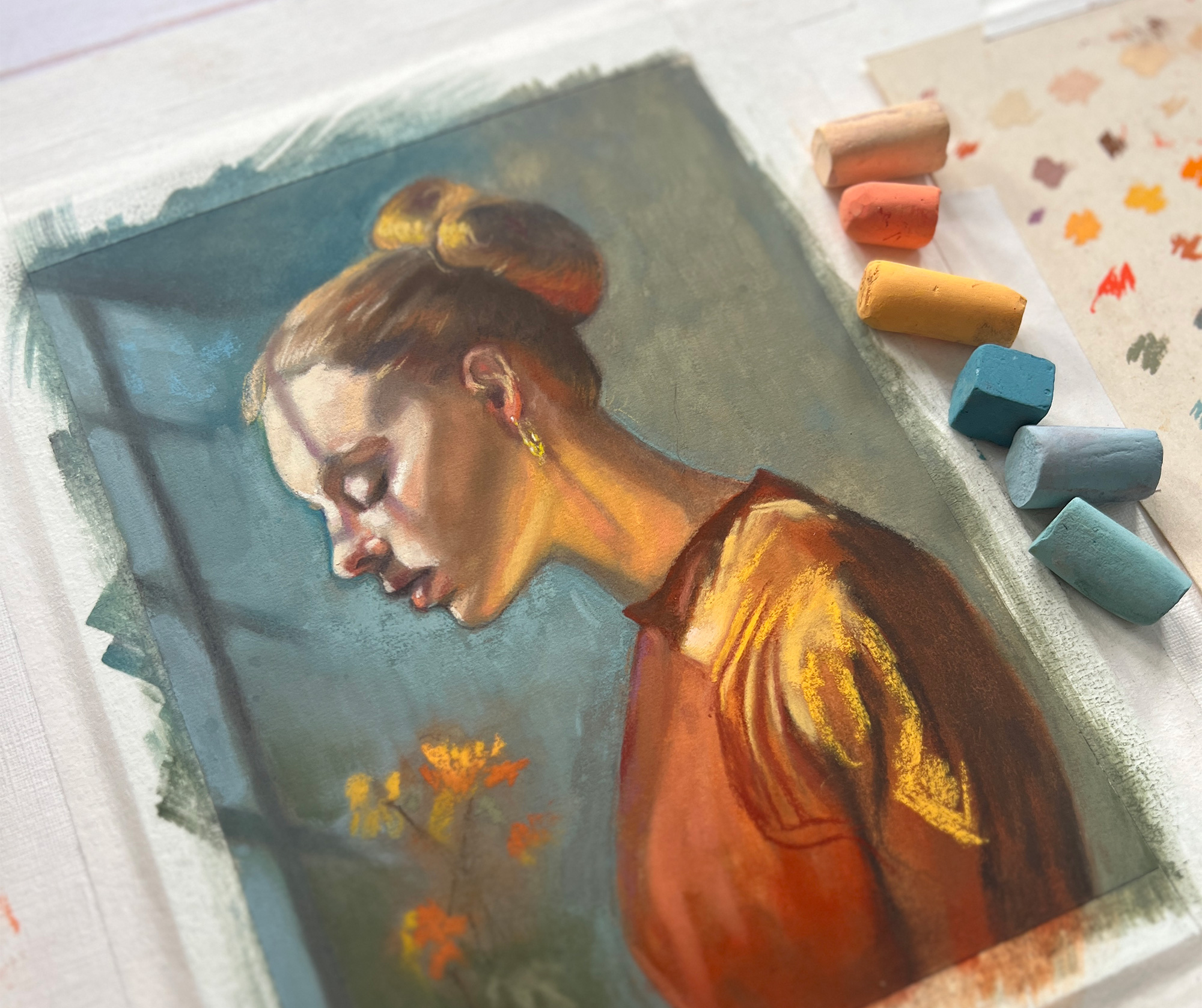
Using a unique technique that combines isopropyl alcohol with vibrant pastels, we'll wash in breathtaking colors to create a light-filled and cohesive background. Our chosen colors—teal blues paired with deep oranges and golds—are not only stunning but also incredibly inviting, drawing you into the artwork.
As we progress, I'll guide you through my personal process of layering light, shadow, color, and form, using both soft pastels and pastel pencils. This technique isn’t just about creating art; it's a meditative journey that brings you into the present moment. We’ll also capture the beauty of sunlight streaming through a window, enhancing and intensifying the colors draped across our figure.
By the end of this class, you will have created a poetic and emotional portrait that embodies deep thought, peace, and introspection. You'll leave with a profound understanding of pastel application, mastery over light and shadow, and new techniques to bring into your own artistic endeavors. Join me on this wonderful journey to deepen your artistic skills and express your creative spirit through the luminous art of pastels.
SUBSTRATE
(I used a sanded surface and my size was only 5” x 7” but please feel free to go bigger, I would recommend 9” x 12” paper if you are not yet used to working with pastels. You can use any sanded surface just try and get a grade of 400-500 so you can layer your colors)
TOOLS
MISC.
BRUSHES
SOFT PASTELS
I used a range of brands from Sennelier, Terry Ludwig and Unison. I highly recommend these brands. They are highly pigmented and have an amazing color range.
Unlike paint colors, pastel artists don’t typically list out exactly what colors they use since you remove the wrappers to use the pastels. Use what you have to match the color palette I use. See image above. You do not have to PERFECTLY match my colors. What is important is that you have a good range of values.
Pastels are a get-what-you-pay-for medium. The more expensive, the better the pigment load and feel of them. I think Senneliers are a wonderful entry-level professional artists brand. I recommend getting a set with as many colors as you can afford. I often buy the half-stick sets. They last a LONG time!
PASTEL PENCILS
I used a range of Pastel Pencils from Carbothello, Derwent and Pitt. I will list what I used below. Again, you don’t need these exact colors. If you don’t have a set of Pastel Pencils I do recommend these brands. Carbothello is the most affordable and they are wonderful.